

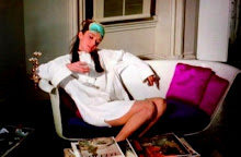
New Version
With the suggestions I was given, I decided to switch the placement of the two photos on the right page. I think there is more balance now that the larger of the two is on top and the captions are reversed.

Old Version
I wanted the first photo to be the dominant one and draw the reader in. The red makes the two sets of text blend together. The captions are mixed in placement. One goes to the left of the photo and the other at the bottom.

No comments:
Post a Comment