Tuesday, May 11, 2010

Final- Los Martincitos


Cover
I chose the photo of the girl walking to indicate "wandering". I also chose the more simple text for the title of the magazine. Splashes of red help pop the headlines out without being too busy.

Layout
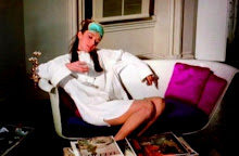
In the end, I decided to experiement with a black background to add a more dynamic feel to the layout. The red and white on top of that background stand out and pull the reader into the main photo of Zevallos (The focal point of the story) The story itself was one of the shorter ones of the bunch, so I decided to put it on one page, breaking it up in spots with a pull quote, side bar and photo.

Tuesday, April 20, 2010

Layout Photo


New Version
With the suggestions I was given, I decided to switch the placement of the two photos on the right page. I think there is more balance now that the larger of the two is on top and the captions are reversed.


Old Version
I wanted the first photo to be the dominant one and draw the reader in. The red makes the two sets of text blend together. The captions are mixed in placement. One goes to the left of the photo and the other at the bottom.

Photo Happy Layout


I thought it was important to have visually diverse photos, while keeping the flow easy and simple. The captions convey the spirit of the piece. I wrapped the text around the photos to break up the copy.

Monday, April 5, 2010

Photo For Online & Print

Edited


Original


This photo was taken in Cancun last summer. The edited version is sharper and more contrasted to show off the highlights of the sand. Thus, the focal point which was the snail is even more pronounced.

Monday, March 29, 2010

Type

Photoshop Assignment: Restoration

Before


After


The first image was fairly in tact and needed little restoration but there were a few spots of discoloration that I fixed with the stamp tool. Next I wanted to change the red quality of the image and went to the hugh and saturation tools to do that. The image has more of a natural tint to it now, though it is on the yellow side of the spectrum.


Before


After


The second image needed more restoration. I used to stam
p tool to cover up the holes and even out some of the color. I also whitened the eye area a bit with dropper tool.

The Student Wanderer: Logo Assignment (In Progress)

Edited Version Below


Originals

So far, I thought it best to focus on fonts and maybe a bit of color. The final font is my favorite. It's called Princeton and suggest an academic feel which corresponds with the subject matter.